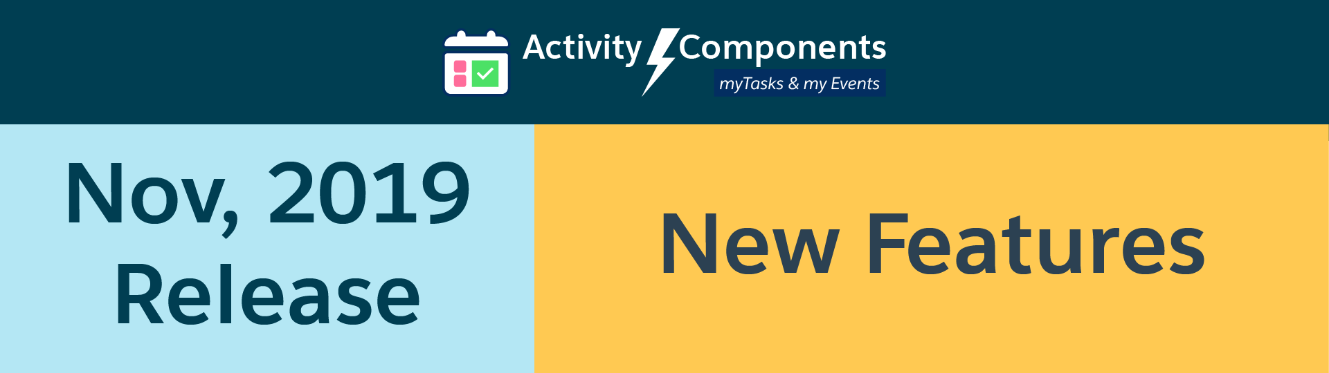
New Feature Alert! These features are part of the November 2019 Release and will be available in Sandboxes and on the AppExchange on October 27th. Existing customers will be automatically upgraded to the version of Activity Components containing these features on November 9th in Production.
Our November 2019 Release delivers a list of new features and UI/UX enhancement that will increase the productivity of your team using Activities Components to track their day-to-day tasks and events and much more!
Important dates to remember for this release:
- October 27 – Available in AppExchange
- October 27 – Automatic Sandbox Update
- November 9 – Automatic Production Update
Please check out the details below to learn more about the November 2019 Release Features.
FREE Version new Features
UI/UX Enhancement
- Spacing between action bar icons, filter list, and new button position alignment, trimming the subject line to show the priority, recurrence, and reminder icons, date format, and mass action checkbox on the right.
- Showing progress icon when retrieving the data in the component
- Mobile UI improvement
- Responsive UI/UX in console apps and community
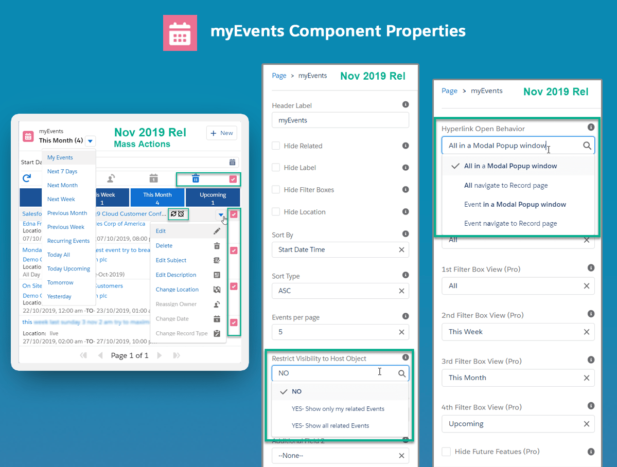
Restrict Visibility to Host Object – Property Update
- ‘Restricted to Host’ property is being renamed to ‘Restrict Visibility to Host Object’
- Also, the property type is changed from a ‘checkbox’ to a ‘picklist’
- Now you have options to define, if you like a component to all of your records OR only your related records to the object OR show all related records to the objects e.g. list only the tasks or events related to the opportunity or account.
- Note: The existing pages will continue to work until you Edit the page. You will be required to provide a valid value to this property for all instances of the components on the page.
Hyperlink Open Behavior – new Property (Desktop Only)
- Most important new property to increase the productivity of the Salesforce User.
- Now you can define the behavior of hyperlinks i.e. Task subject, related account, contact, or opportunity link. You can either continue to have these links take you to the record page or Open the record in a MODAL window on the same page.
- This will allow users to remain on the existing page and view Tasks Details, Edit, or View related objects details.
- You may choose to only open Tasks or Events in a MODAL window or just related objects or both.
Show reminder and recurring icons in both myTasks and myEvents Components
- Now you can see the reminder and recurring event icons along with a priority flag for each task or event in the subject bar
New inline Action ‘Edit Subject’ in both myTasks & myEvents Components
- New ‘Edit Subject’ inline action is added to allow users to edit the subject quickly for any given task or event without leaving the page
New ‘Recurring Events’ Filter View in myEvents Component
- Added a new ‘Recurring Events’ filter in the Events picklist to allow users to view only recurring events
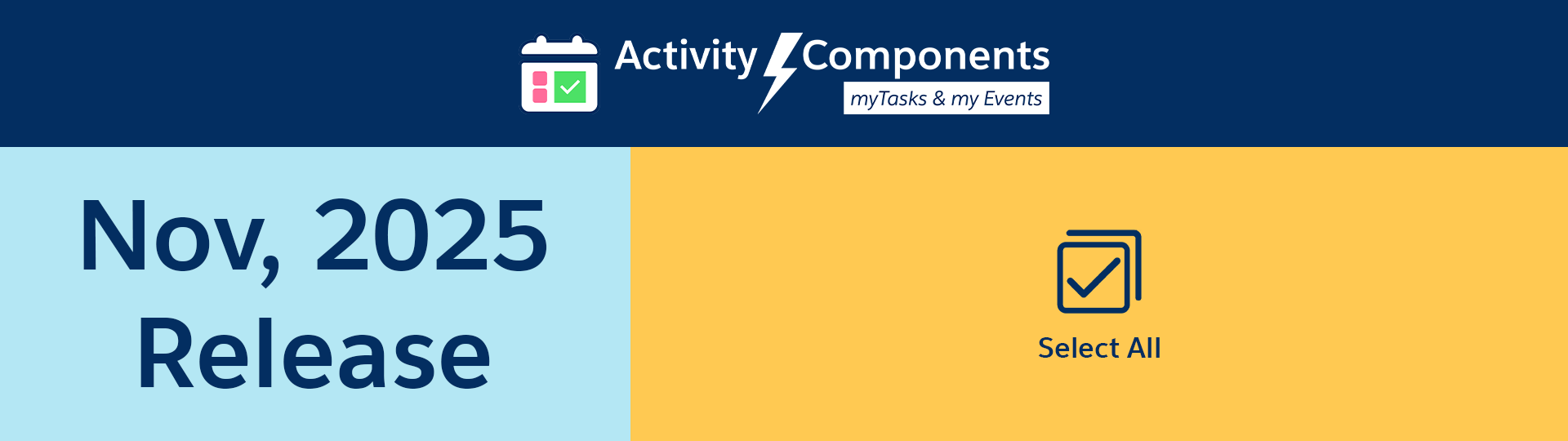
Pro Version Only Features
- All Features in the FREE Version plus+
- The most requested feature i.e. Mass Actions are being released in November 2019 release
- A new Select All checkbox is added in both myTasks and myEvents components on the RIGHT side on the action bar that allows you to select multiple records on the given page in the list.
Mass Actions in myTasks Component i.e. Mass Update Due Date, Status, and Mass Delete
-
- Mass Update Due Date: Allows you to select multiple tasks on the current component page and change their Due Date at once
- Mass Update Status: Allows you to select multiple tasks on the current component page and change their Status at once
- Mass Delete: Allows you to select multiple tasks on the current component page and Delete them
Mass Actions in myEvents Component i.e. Mass Delete
-
- Mass Delete: Allows you to select multiple events on the current component page and Delete them
Stay tuned for more updates, as we are working adding more and more features to our Pro Version in the next few releases.
New Feature Highlight!
myTask Component Properties: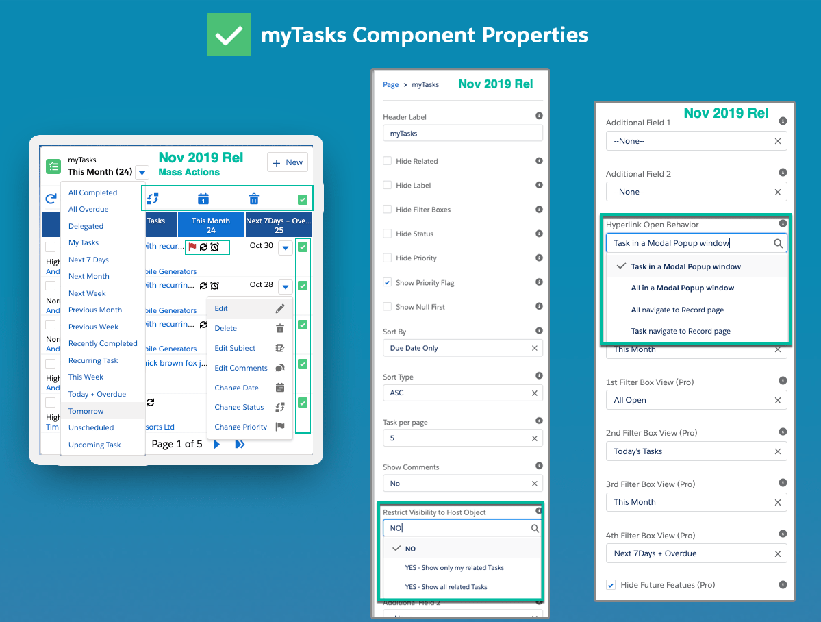
myEvent Component Properties:
Please reach out to us via email [email protected] if you have any questions or concerns.
Don’t forget to Install or Update to the latest release for FREE i.e Salesforce AppExchange
Request a Free Trial / Upgrade to Pro Version